SHOOT, DON'T TALK
YEAR:
2021
CATEGORY:
EDITORIAL DESIGN, CONCEPT
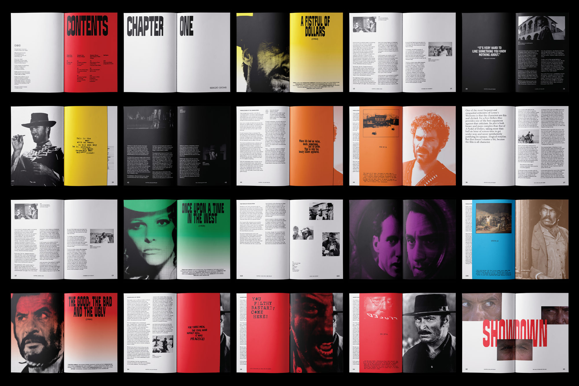
Developed with Studio FM Milano—Shoot, Don’t Talk! is a compendium of the visuals of Sergio Leone’s filmography, who is arguably the most prominent Italian western filmmaker of all time. Covering his two iconic trilogies, the book features the analysis of Leone’s thematic narratives through his iconic shots and visuals. The book also features a brief story of Leone’s unconventional ascent to the pantheon of world’s greatest filmmakers. Interpretative artworks of Leone’s visuals by the author are also presented throughout the pages to complete the visual experience. To promote the book release, a series of out-of-home promotions were also designed.


SETTING THE STAGE
Sergio Leone was known for his meticulous attention to detail. To craft the cinematic spectacle seen on screen, he meticulously planned every aspect of the set, creating a stage primed for controlled chaos. This approach inspired the book’s grid system, with a baseline grid spanning the spreads vertically, allowing for intentional placement while maintaining the flexibility to adjust the layout.

VISUAL OVERTURE
Though Sergio Leone’s filmography is relatively small, his opening credits were crafted with great care, setting the tone through bold typography, striking compositions, and meticulous detail. This same approach informs the book’s design as its typography, graphic treatments, and layout pay homage to Leone’s distinct cinematic style, capturing the grandeur, tension, artistry—and chaos, that defined his films.

TYPOGRAPHY AND GRAPHIC TREATMENTS
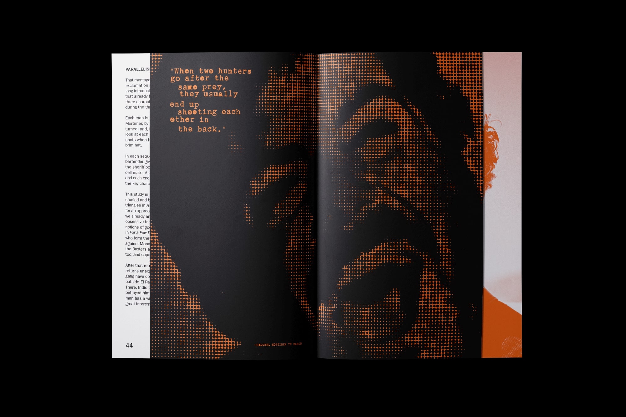
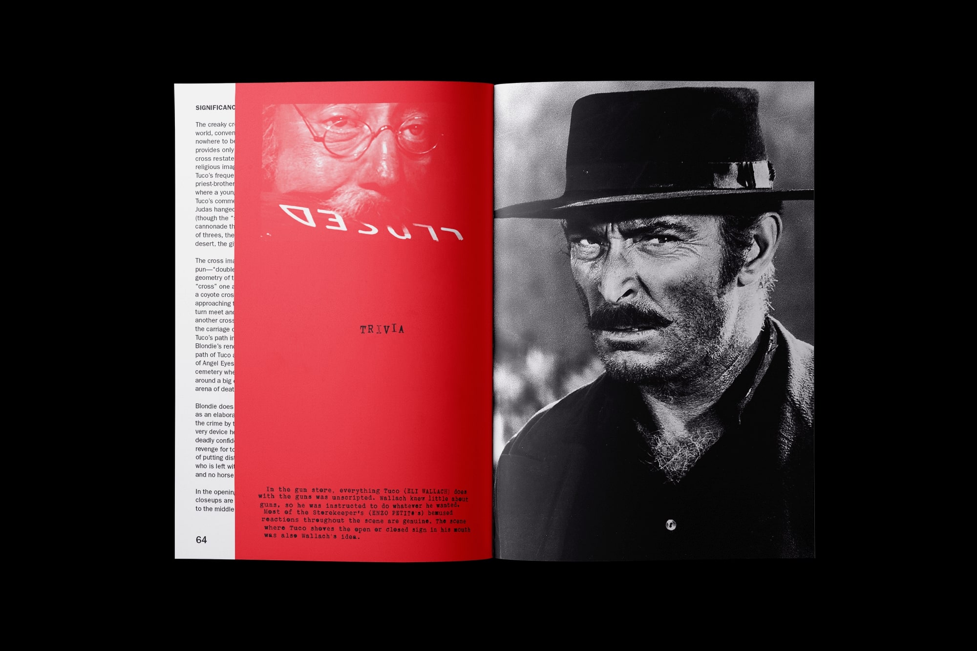
Echoing the gritty visuals of Sergio Leone’s films, halftone effects heighten tension and visual drama throughout the design. The typography draws direct inspiration from his bold and audacious opening credits, balancing visual "oomph" with refinement. The humanist typeface Stempel Schneidler adds character as a subhead, while Franklin Gothic, with its newspaper-like feel, reinforces the raw, textured aesthetic of Leone’s filmography. Both typefaces provide a balance of readability and typographic personality.
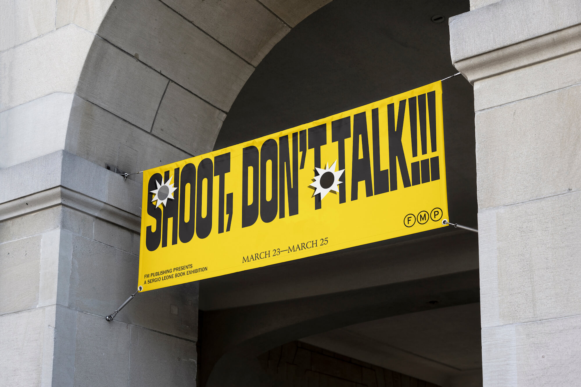
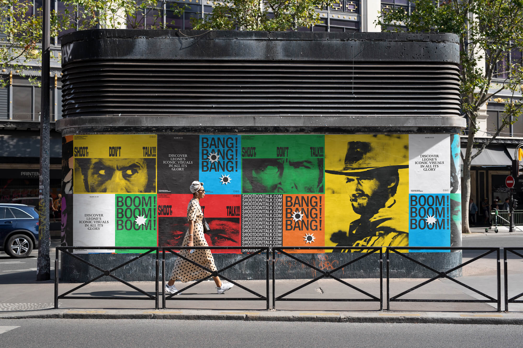
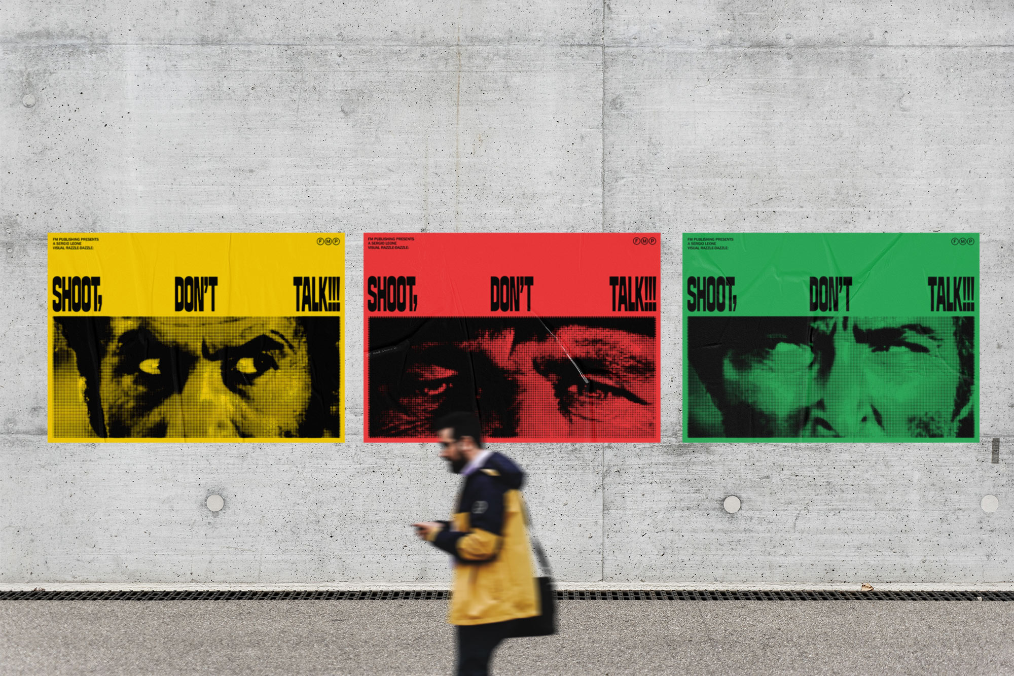
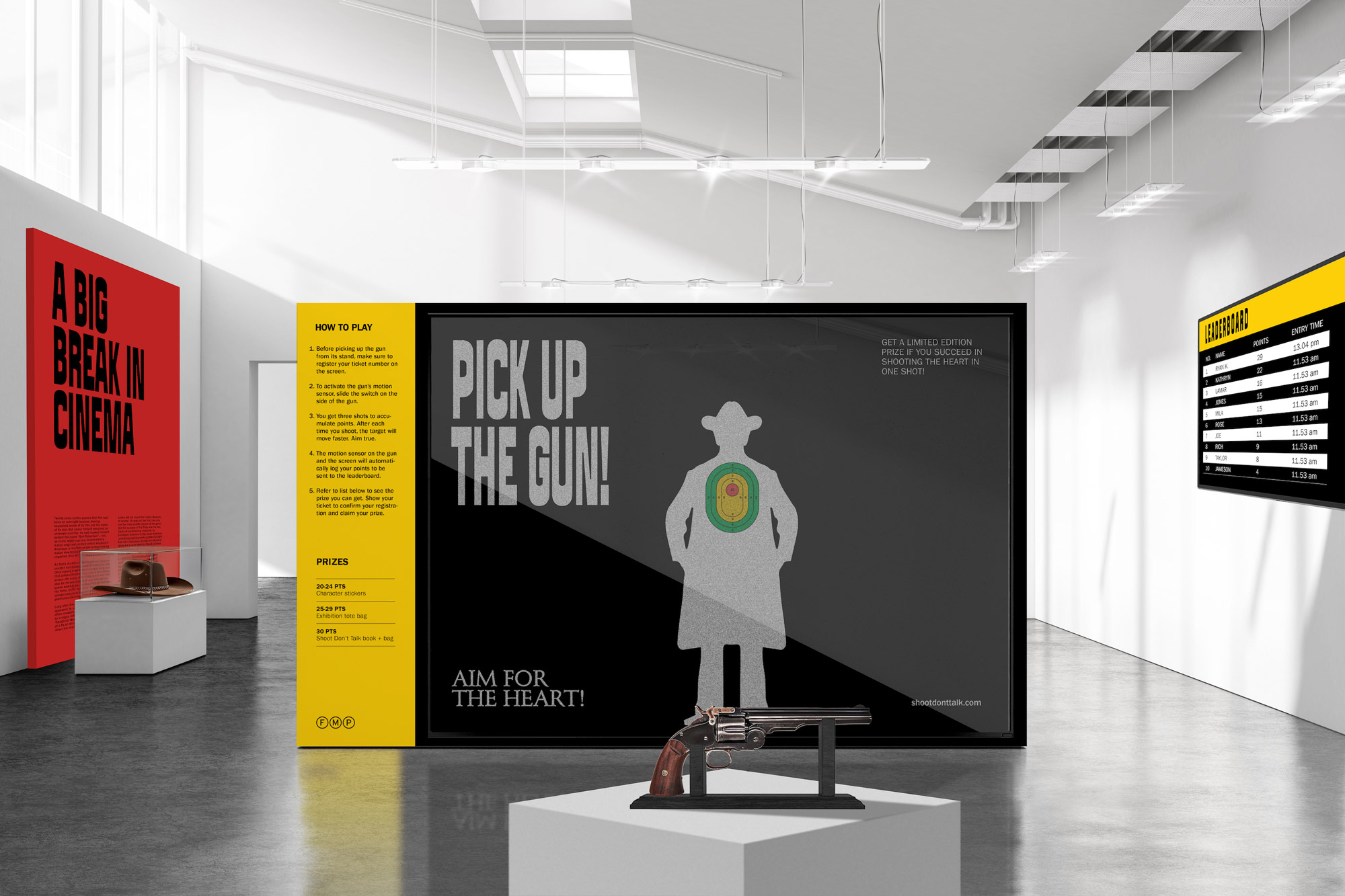
PROMOTIONAL DESIGN AND ACTIVATION
To promote the book launch, a series of campaigns were designed, including out-of-home banners, posters, an experiential activation, and a trailer. As if bringing a gunfight to life, bullet marks feature prominently on the campaigns, reinforcing the raw intensity of Sergio Leone's filmography. Each campaign element expands on the visual language established in the book, drawing from its design and cinematic inspiration.